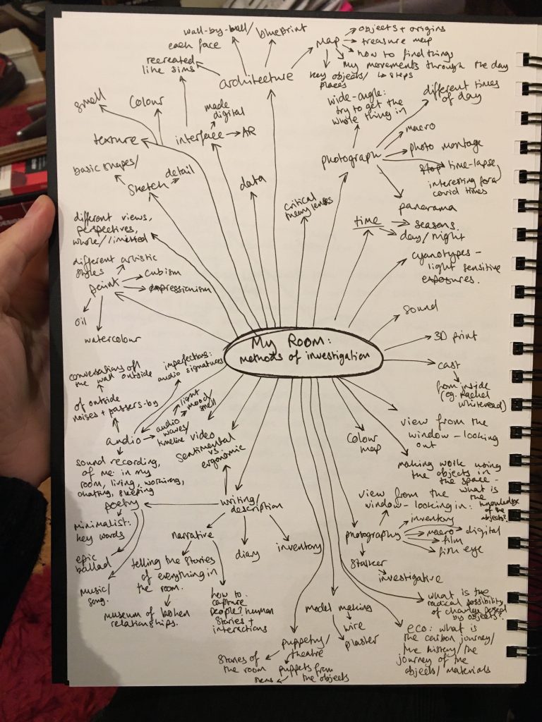
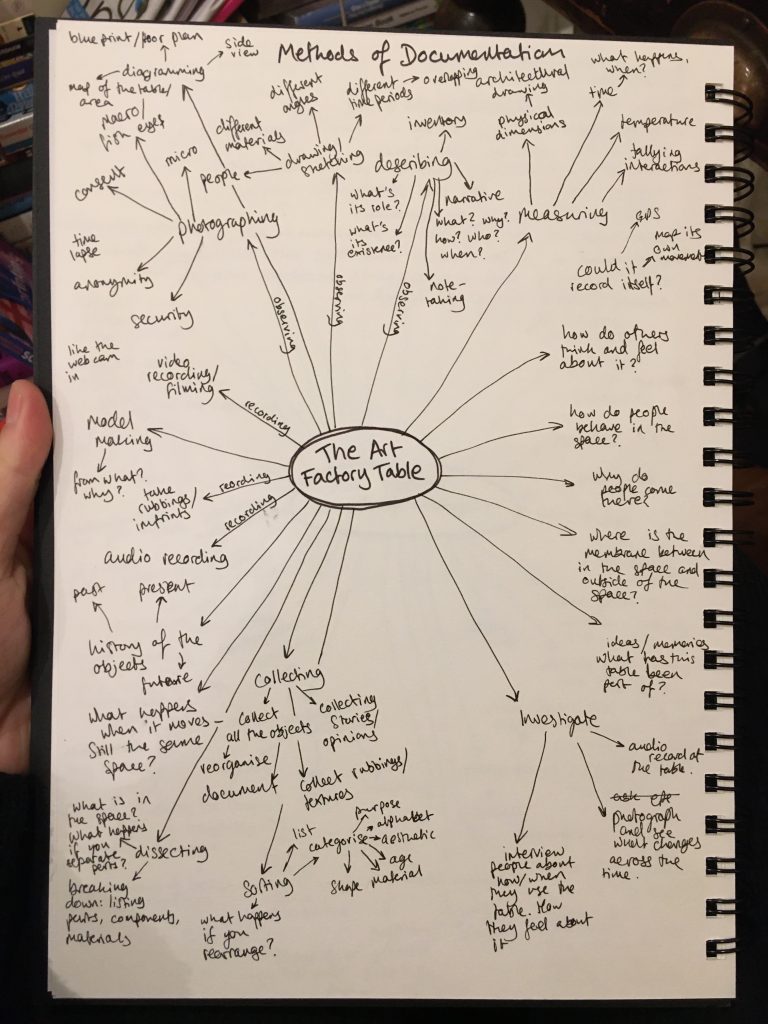
Testing, testing. 1, 2, 3. Deciding on which category to choose (space, publication or interface), exploring different investigation methods for each – how would these investigation methods transfer to the other categories. Which sites could I choose for each?
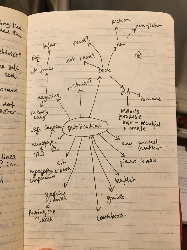
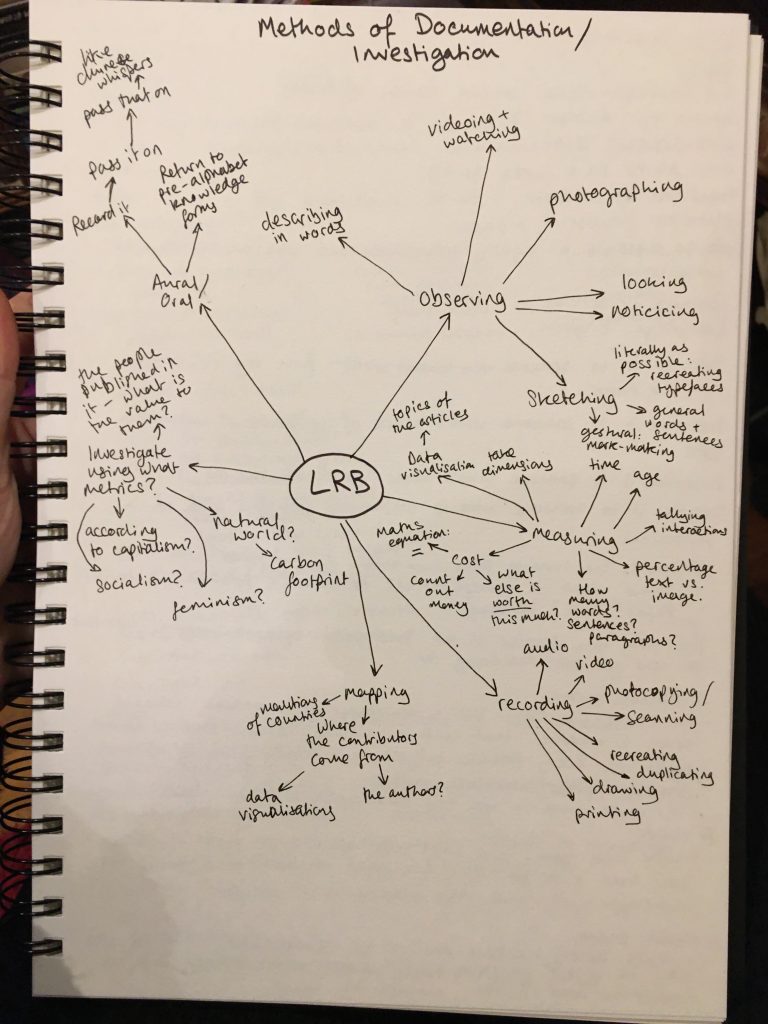
Settling on Publication: The LRB, and starting to investigate, through written and verbal description and documentation; familiarising myself, getting to know it. Starting the process of criticising those processes – what are its strengths? weaknesses? Implicit biases? Unintended consequences?
Describing to someone else:
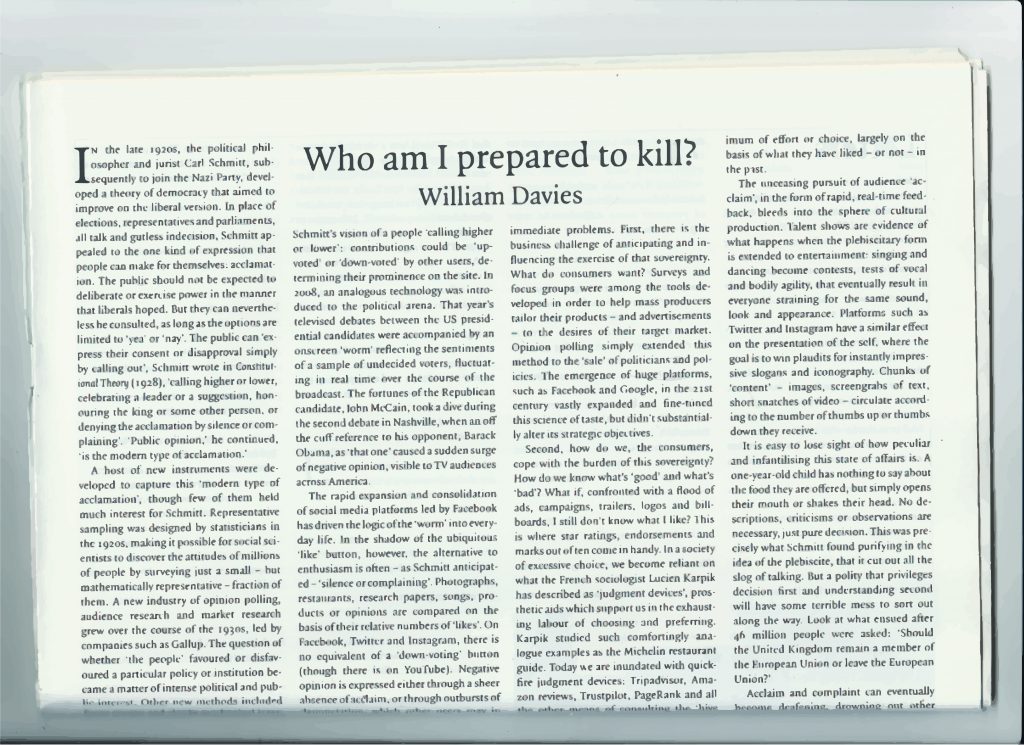
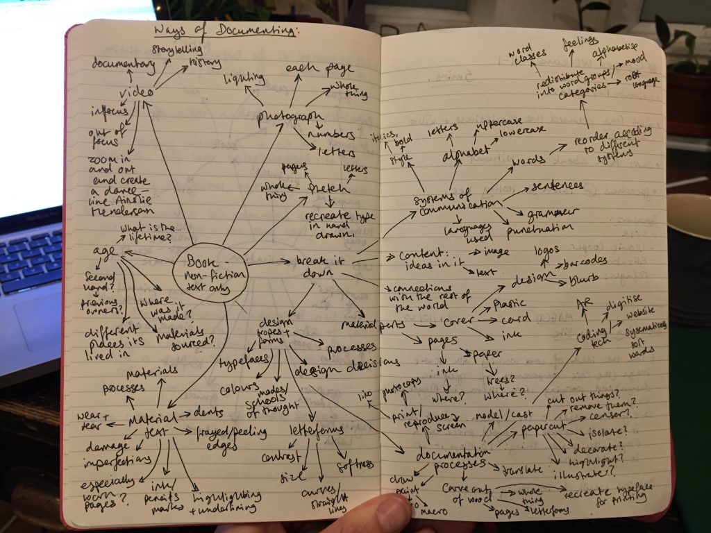
A simple photographic series, page by page. Why do we document? To keep records, to remember, to be able to refer back. These are some of the most common reasons. Photography is by far one of the simplest and most effective ways of doing this, especially since many more of us have access to camera phones than scanners. I explore its strengths and weaknesses below.


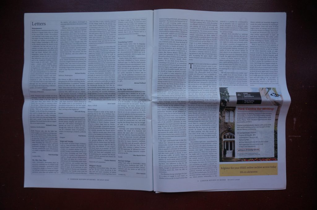
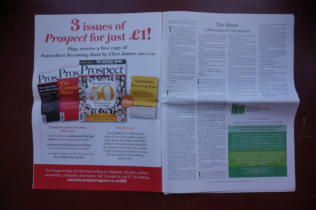

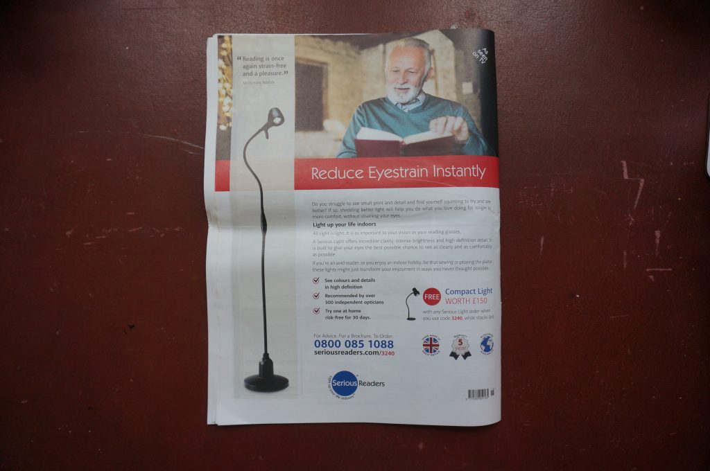
Photo vs. Scan
I used macro photography (or as macro as my camera would go) to explore textures, lesions, wear and tear, breakages, strains, creases, imperfections. I was interested to discover the places where the print shows through from the other side. I like the places where the staples and folding have created a pattern of mirrored creases, and the mountains and valleys created by the fold. The yellowing of the outer fold could simply be age… or it could say something about the air in our living room/kitchen where our journals are stored… To be honest, I’m surprised it isn’t more gross in there, given how much and often we cook.
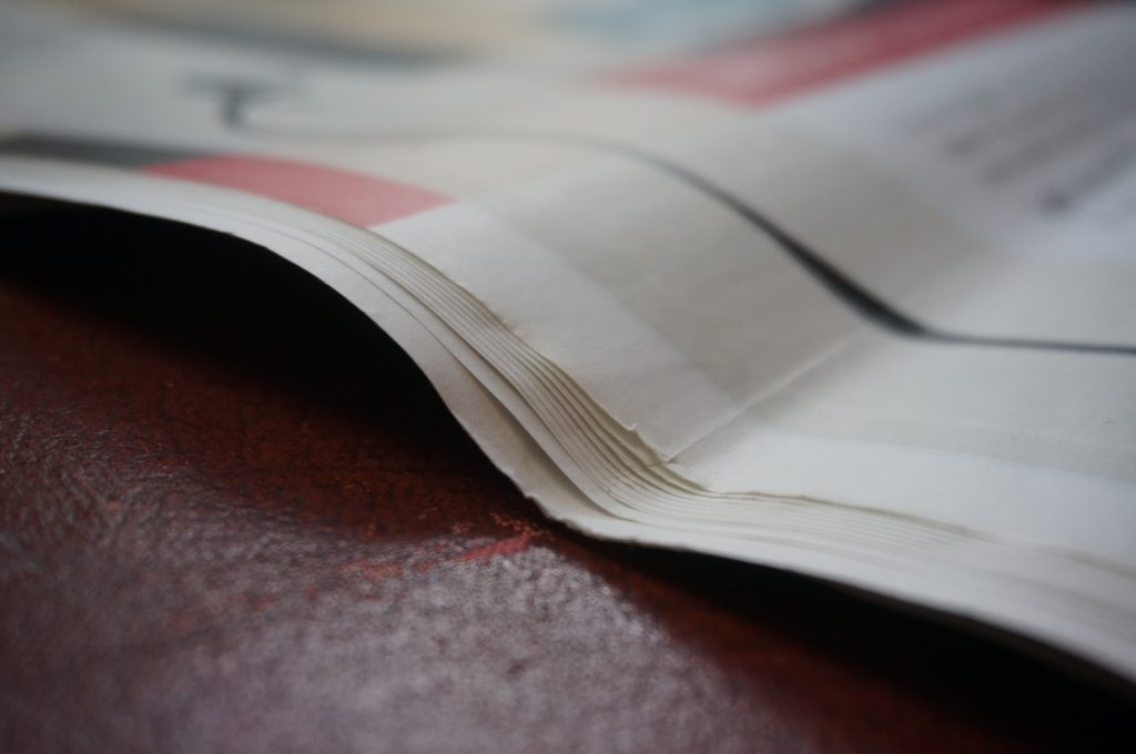
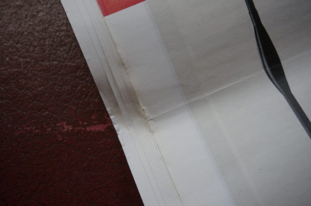
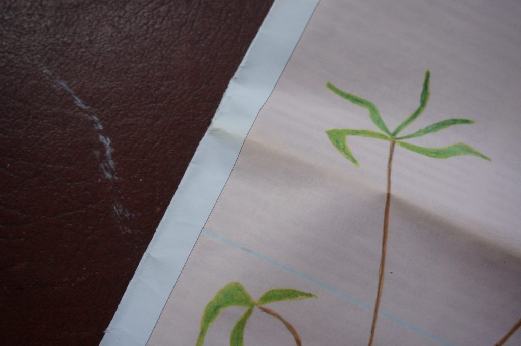
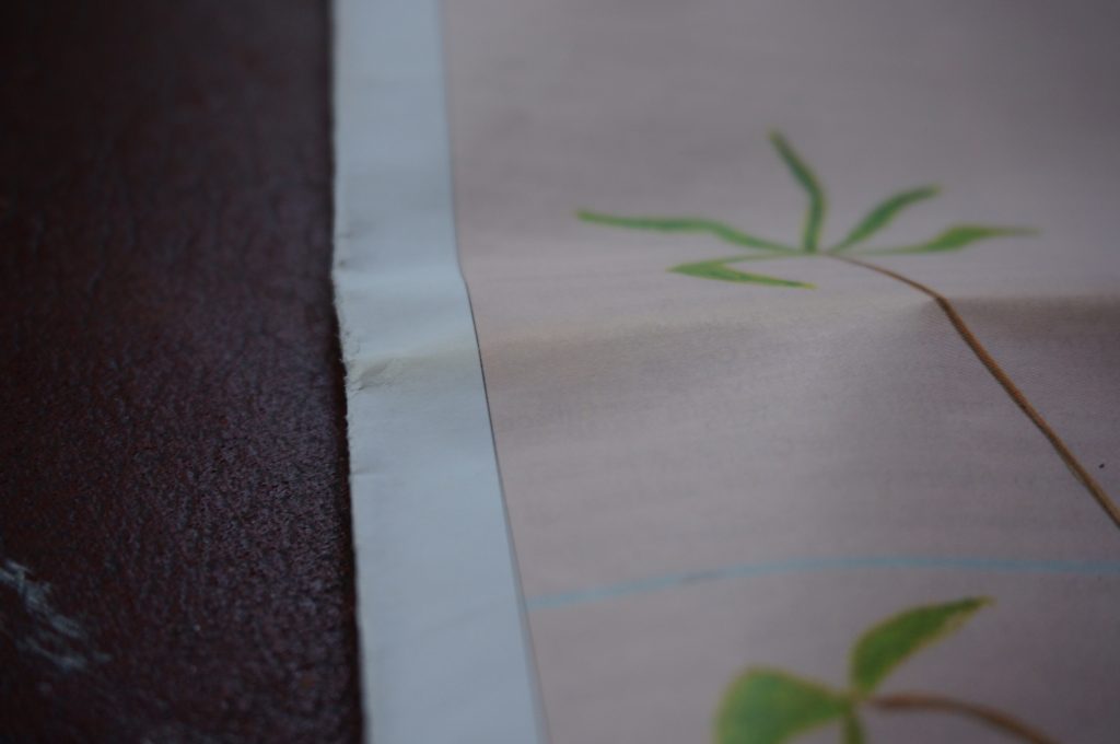
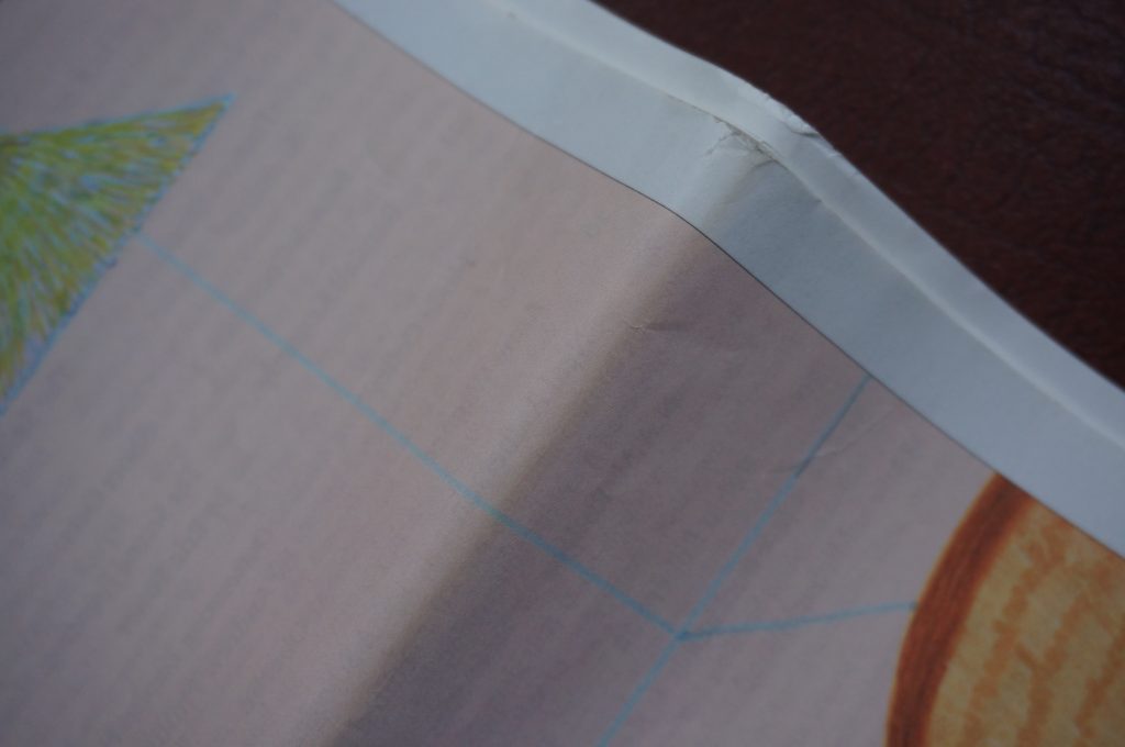
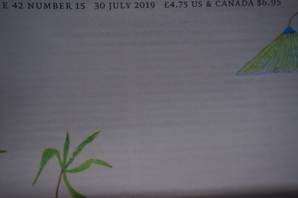
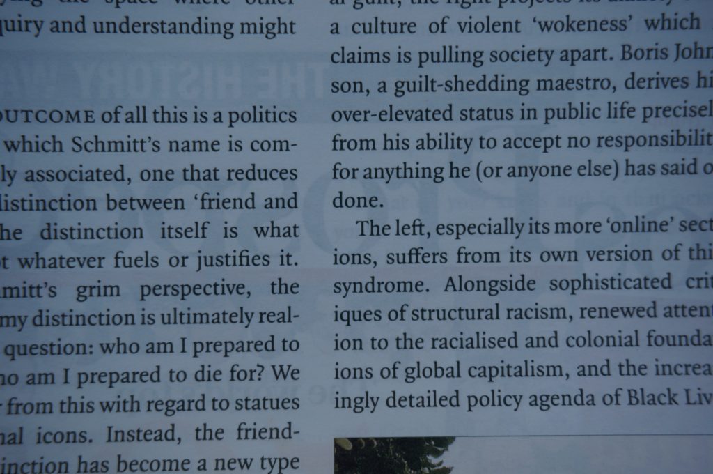
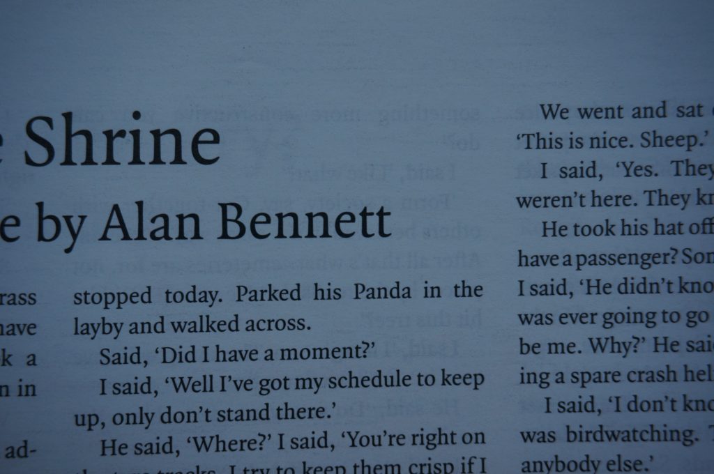
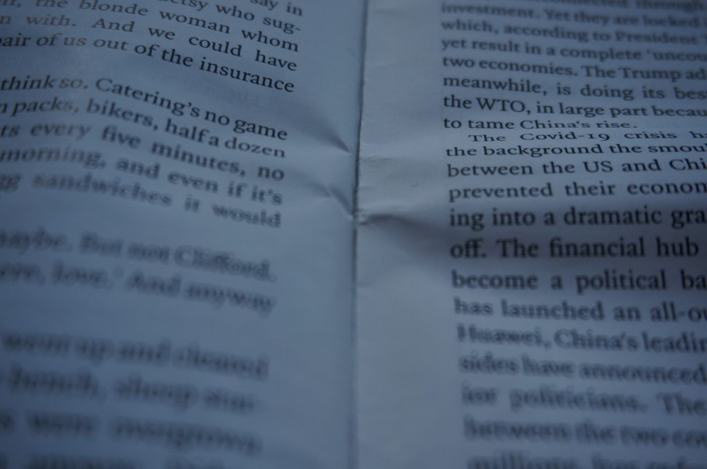
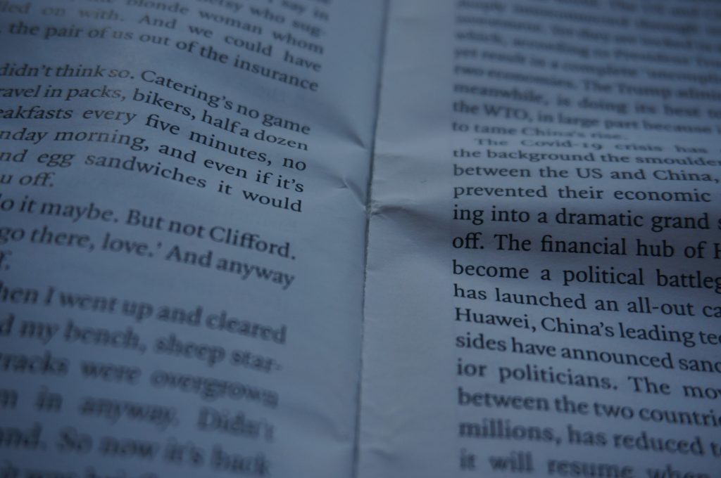
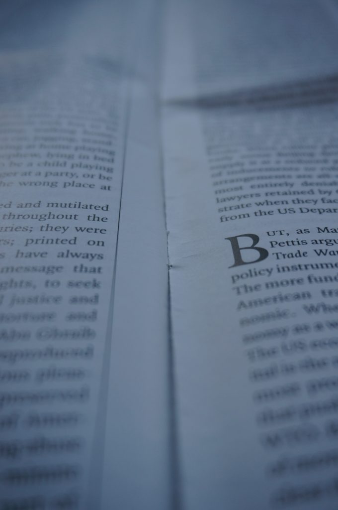
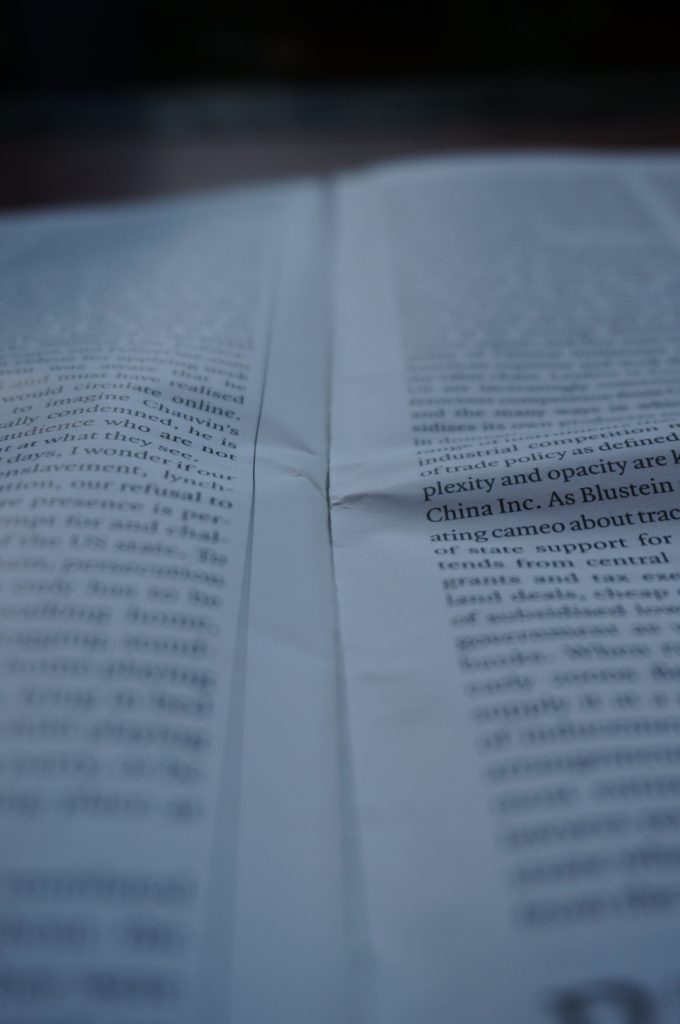
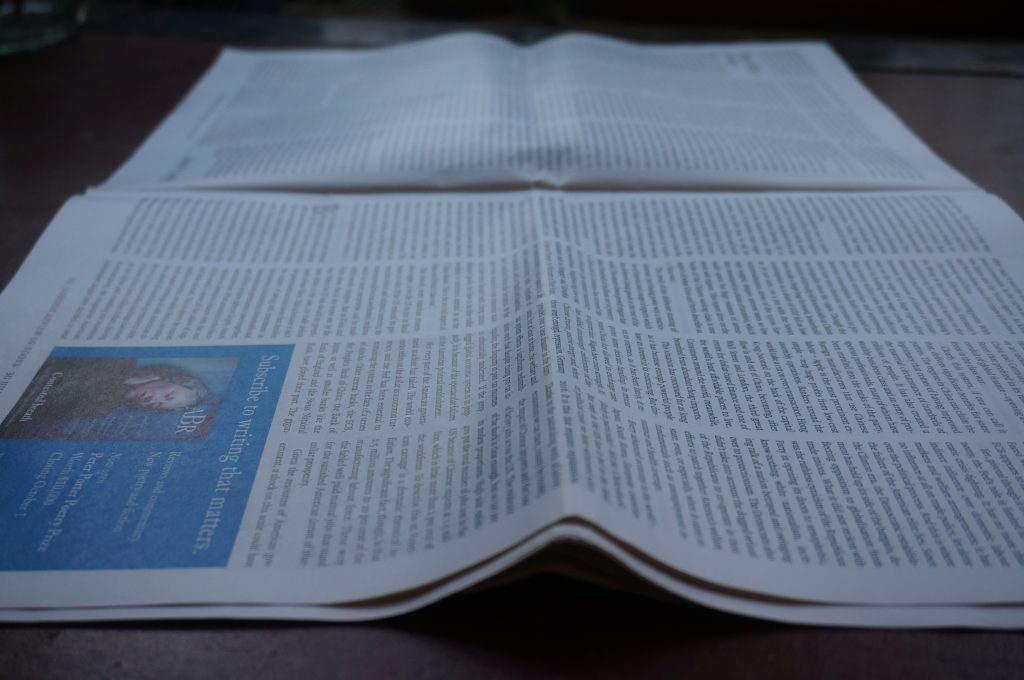
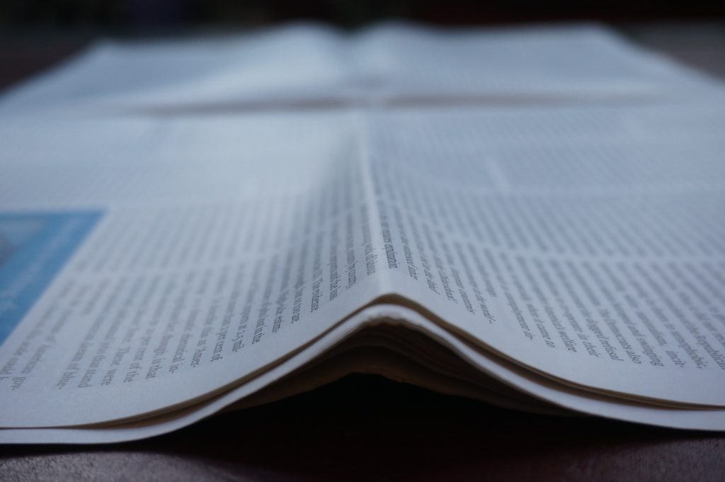
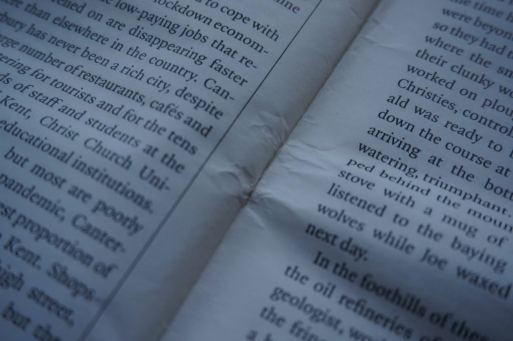
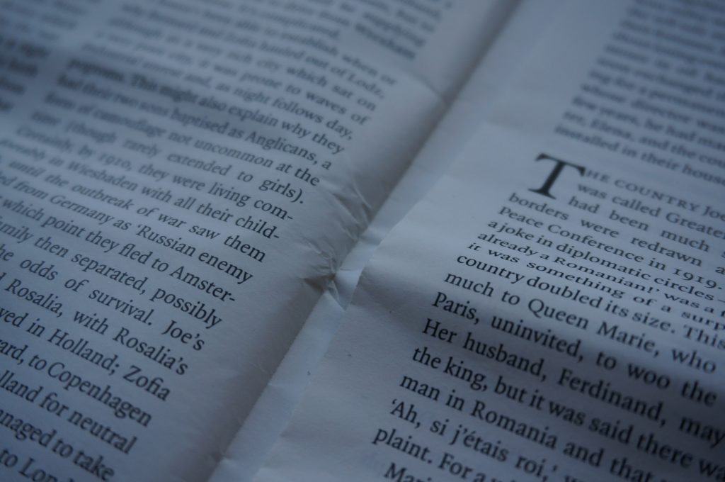
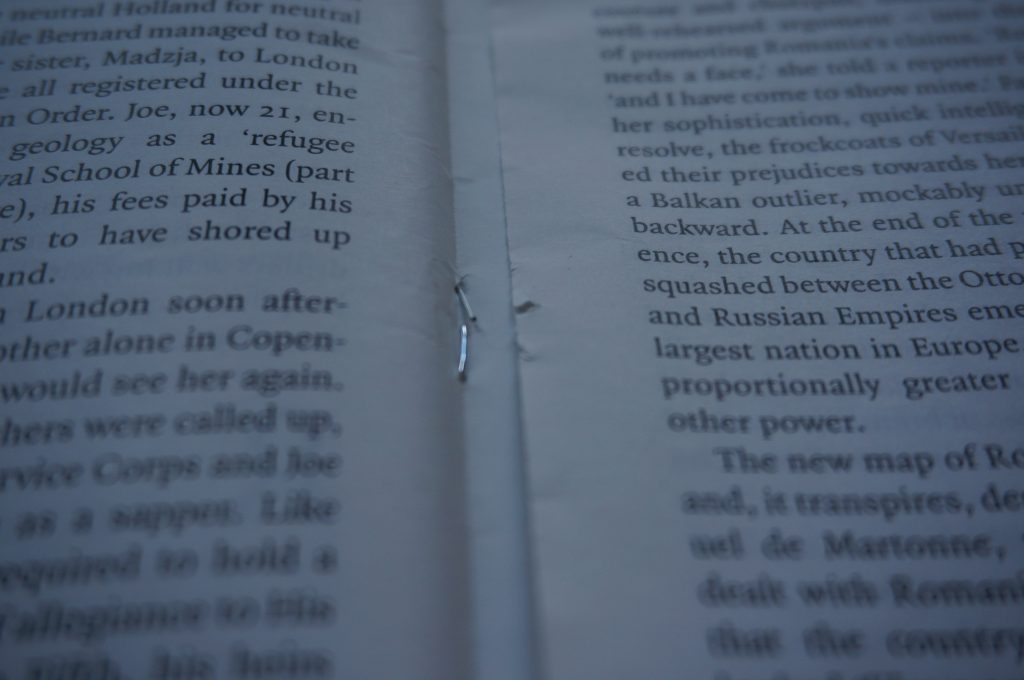
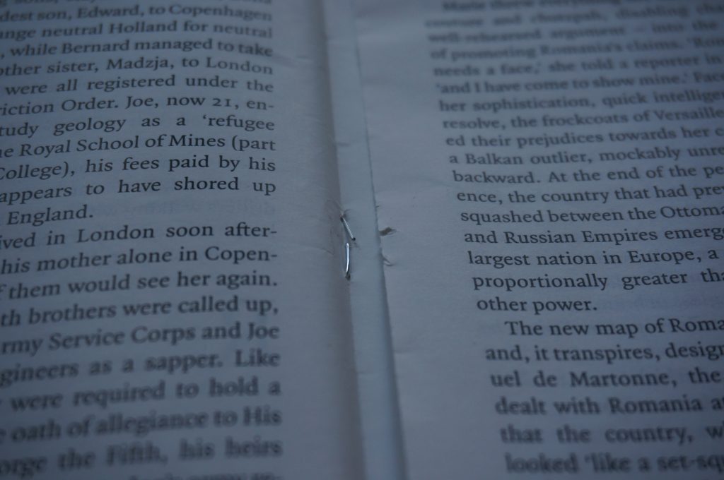
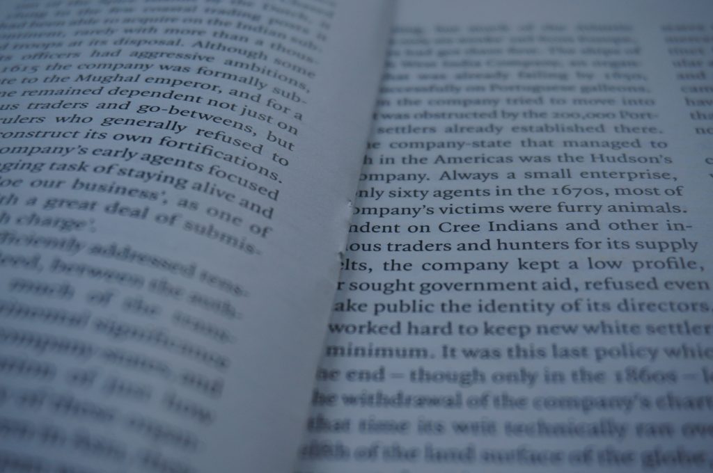
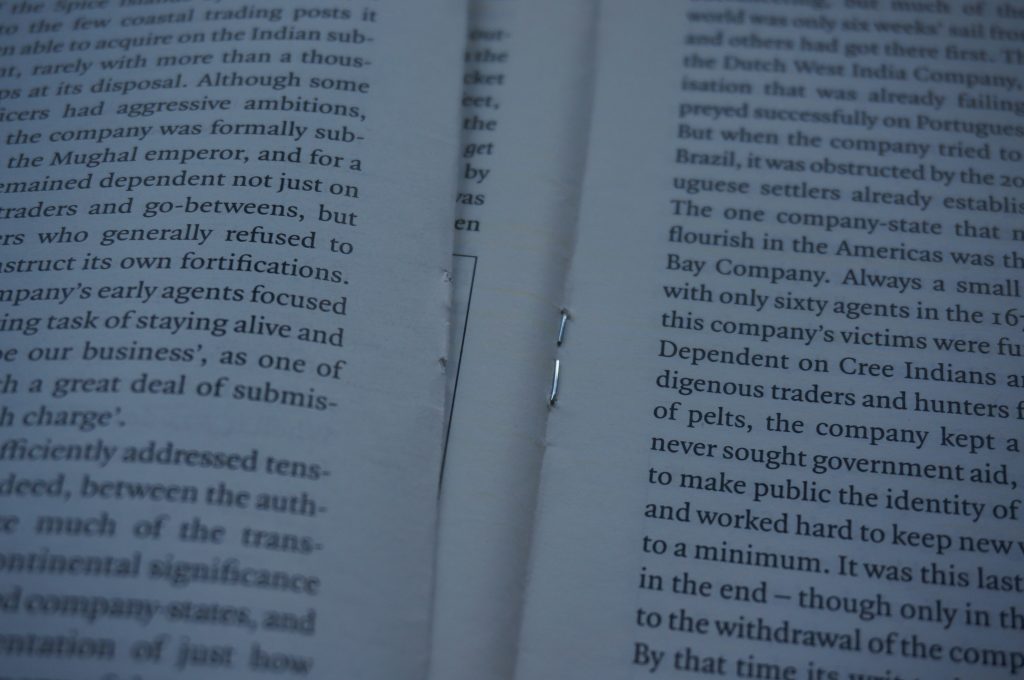
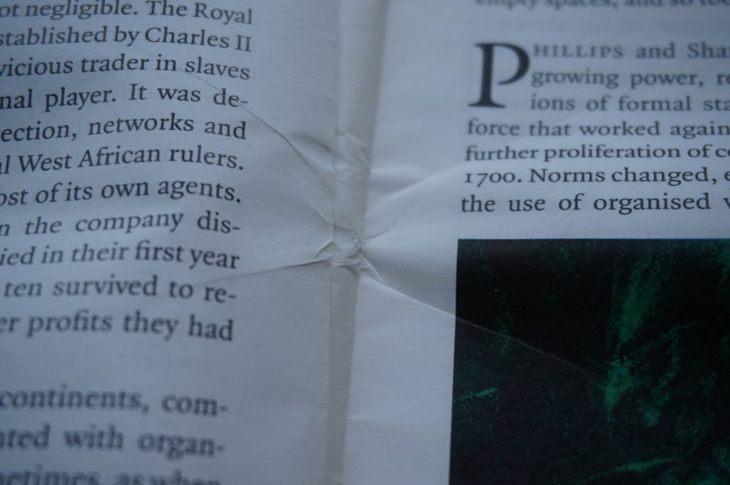
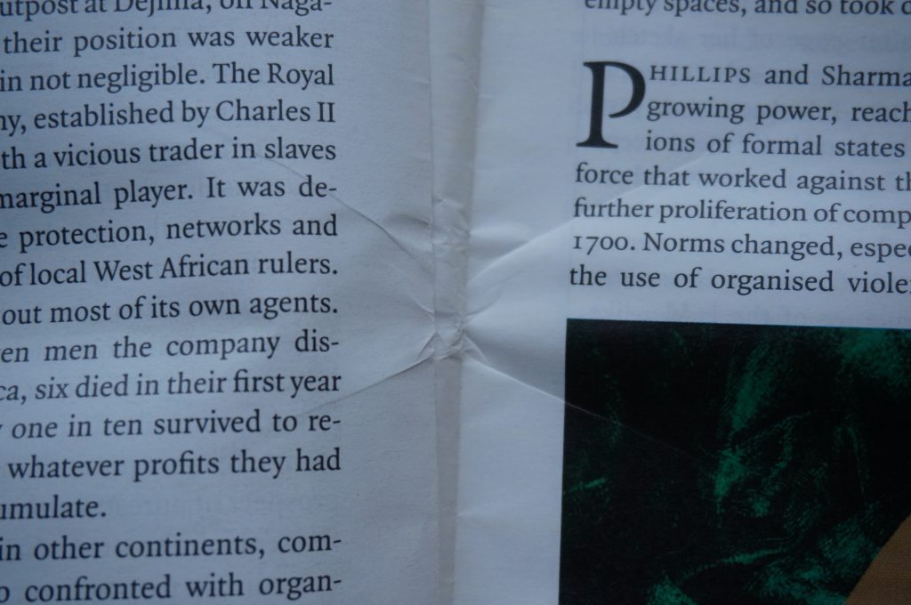

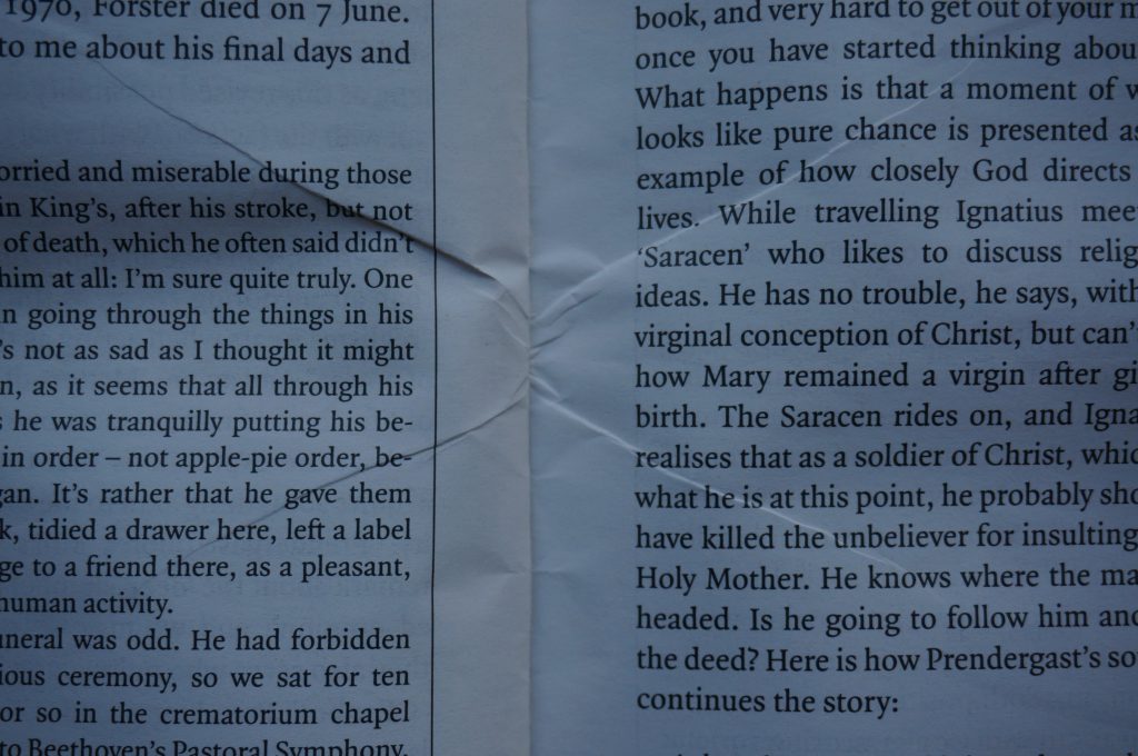
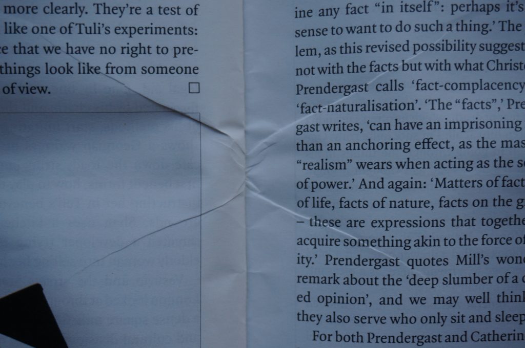
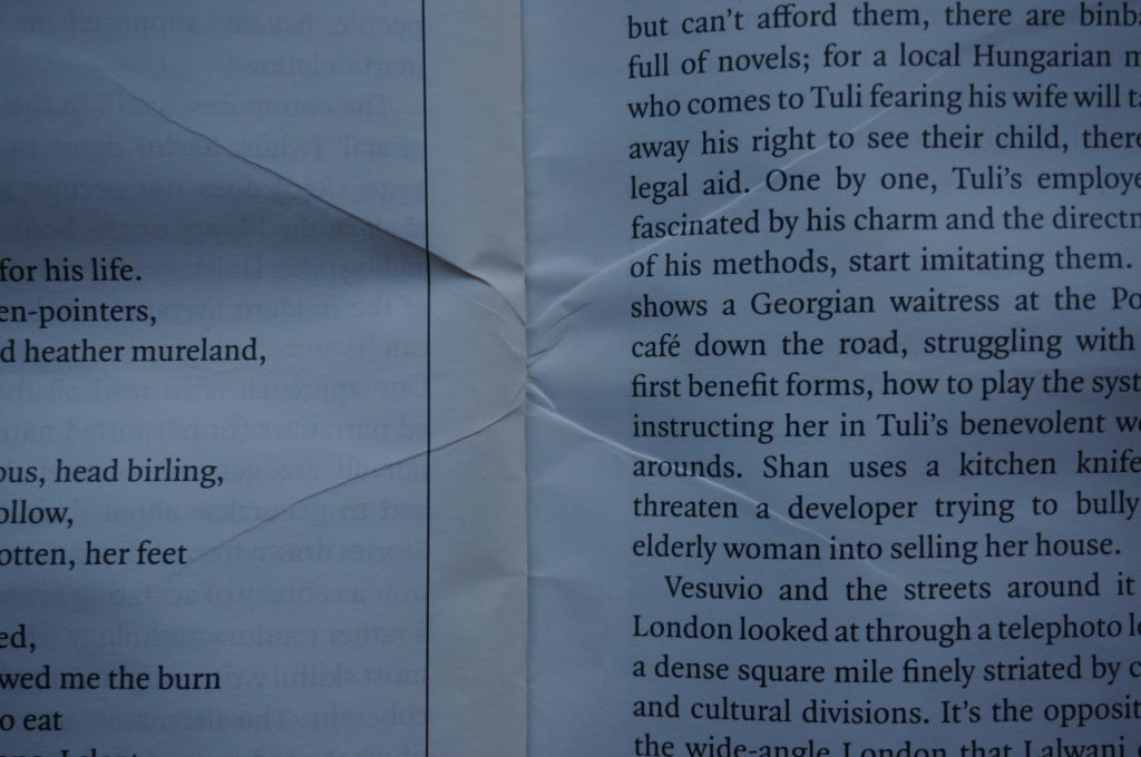
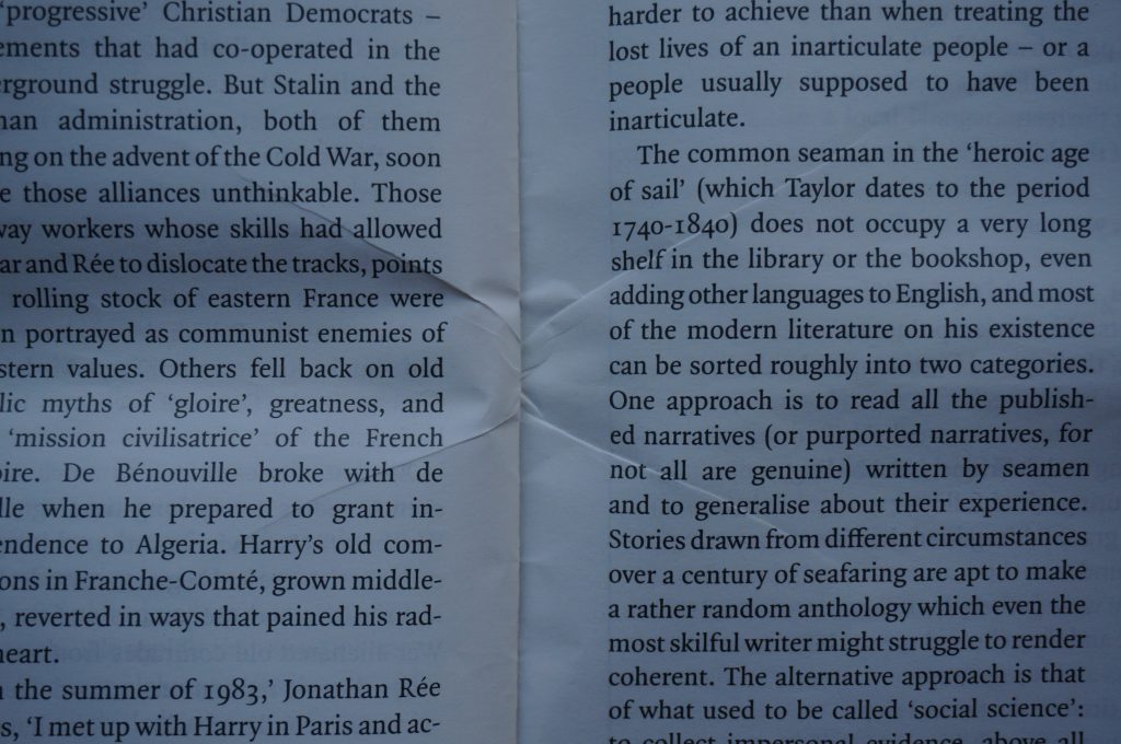
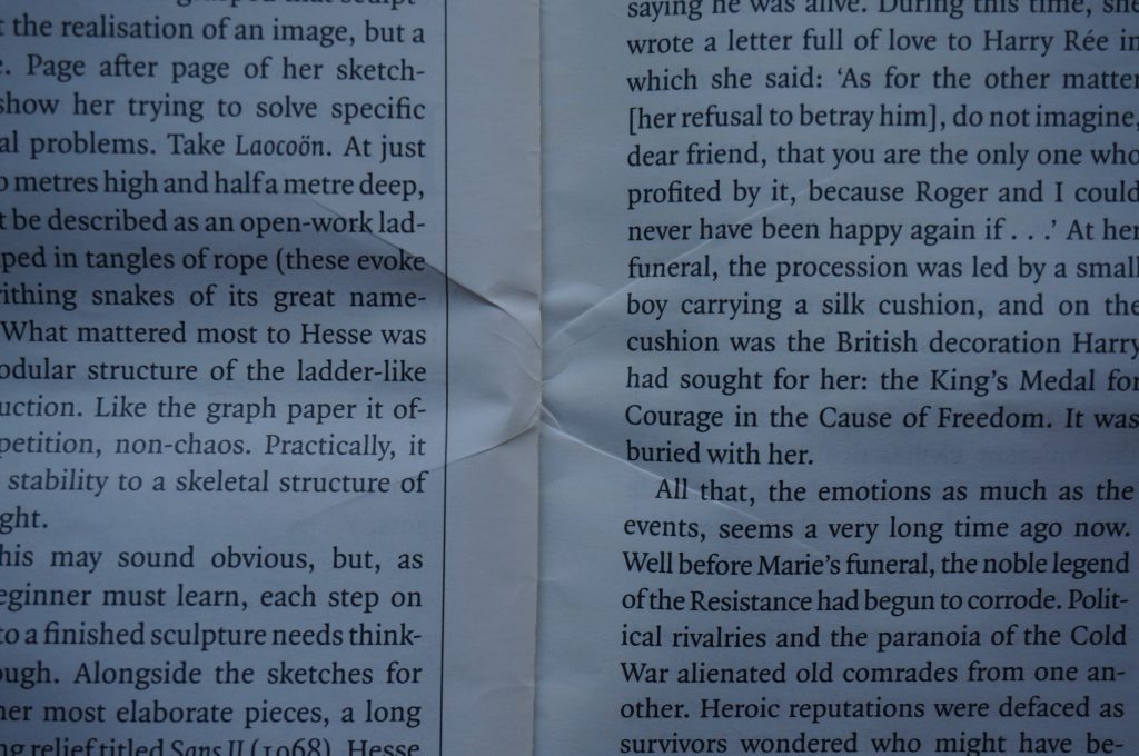
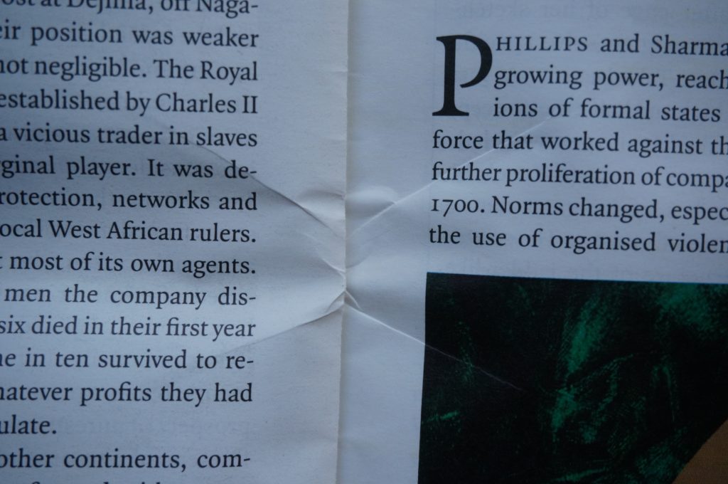
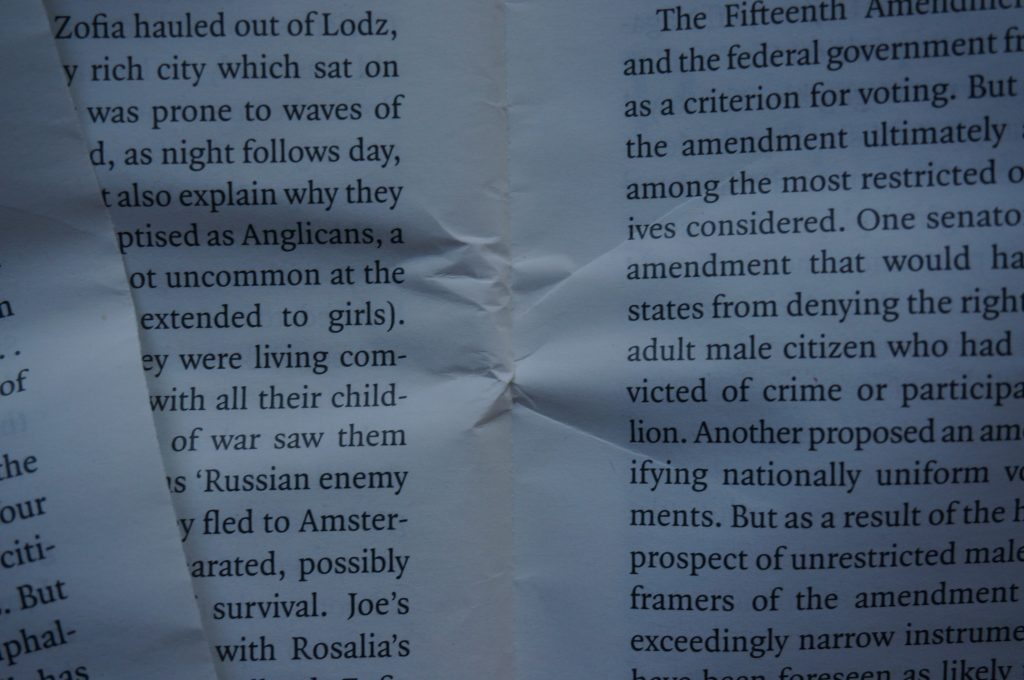
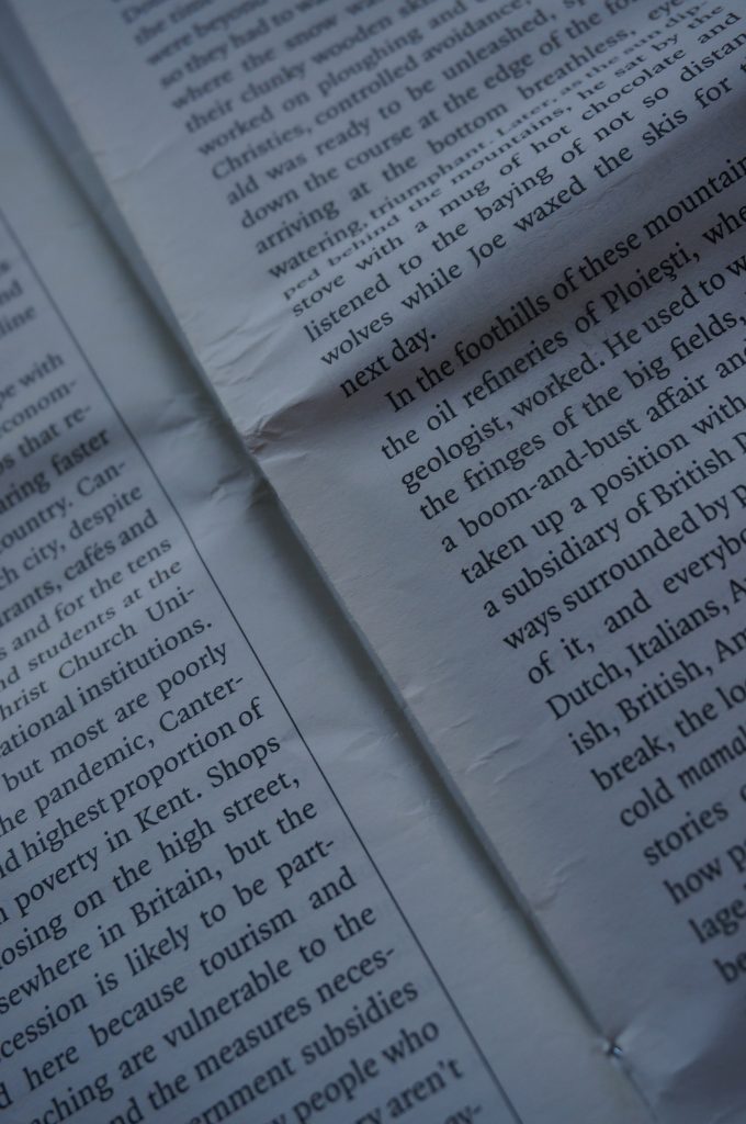
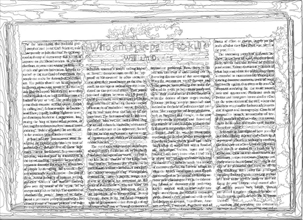
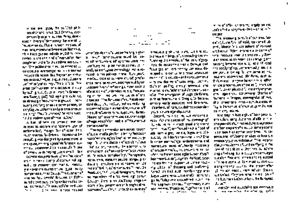
Image Tracing: what happens when you try to vectorise the scans? This is a great way of documenting, often, because it stores the information in points and vectors. Infinitely scaleable. Easily reproducible. High contrast. But you’re asking the computer to translate/recognise human language… The results are fascinating. On its auto settings, it captures the essence of the page – the general texture, the mark-making, the layout. But zoom in closer and the words are illegible. Does this matter? What is it I want to document? With some adjustment of settings I can get it to capture the words legibly, if heavy-handedly. When I ask it to create a high-res image, it uses many layers and contours to capture the subtlety of the colour shifts. Translated into outlines and this is fascinating. You discover the contours of the colours in a whole new way, and the way these contours gather around words gives the language a sort of magnetism, and the page a geography, even if it’s not that legible. Finally I asked it to recreate the page as line art – it seems to have picked up only the places where it thinks there are lines, and no fill, as it’s basically ignored the bold title. The documentation of the body text is fascinating – like braille, or Hebrew – mostly vertical and horizontal lines, and dots.